
Radiant Chiropractic Care
UI/UX Design & Development
Role
UI/UX Design & Development
Status
Complete
Services
Waterfall / Linear
Project Type
Mobile & Tablet App
Software Used
Brief
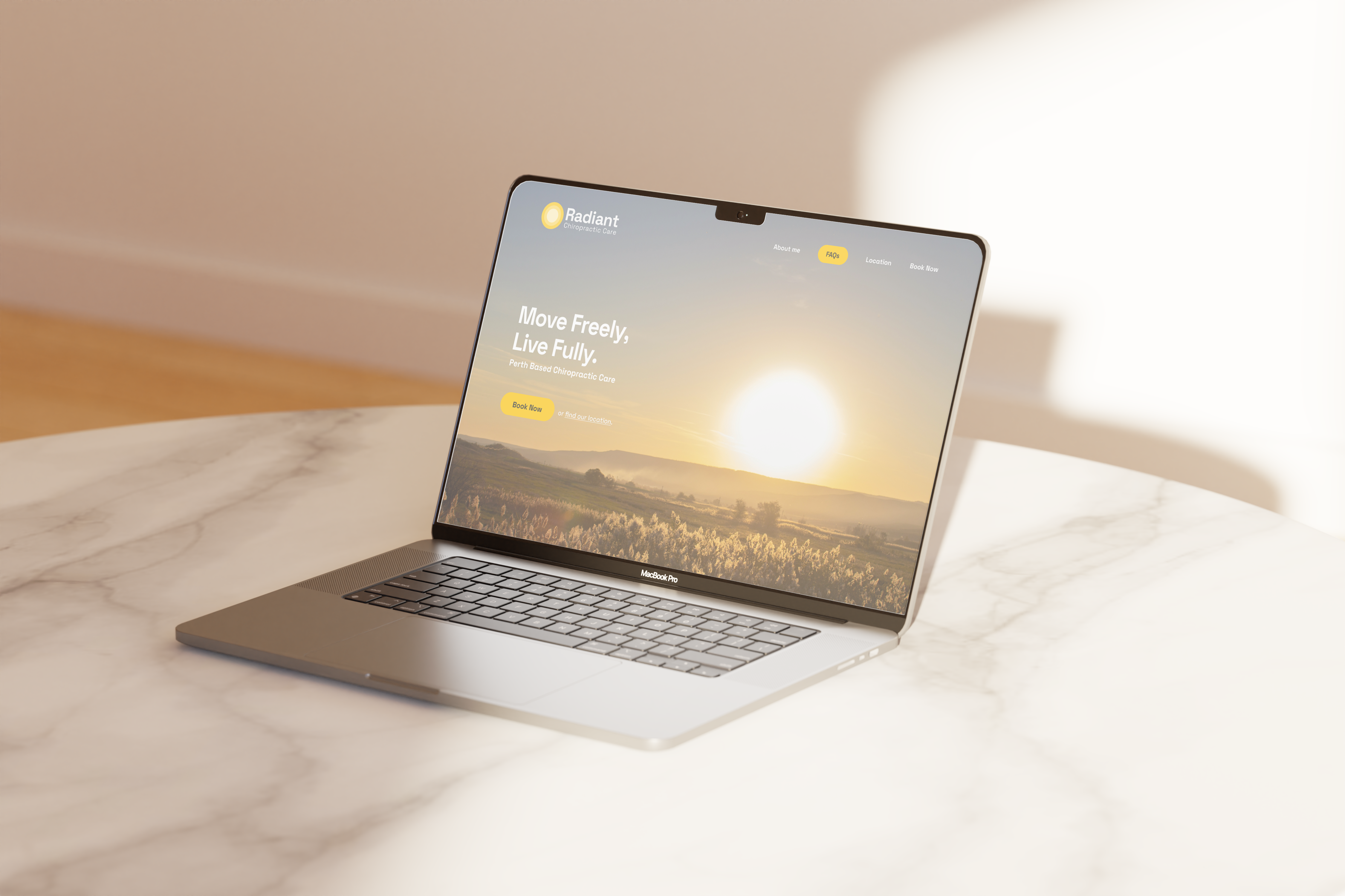
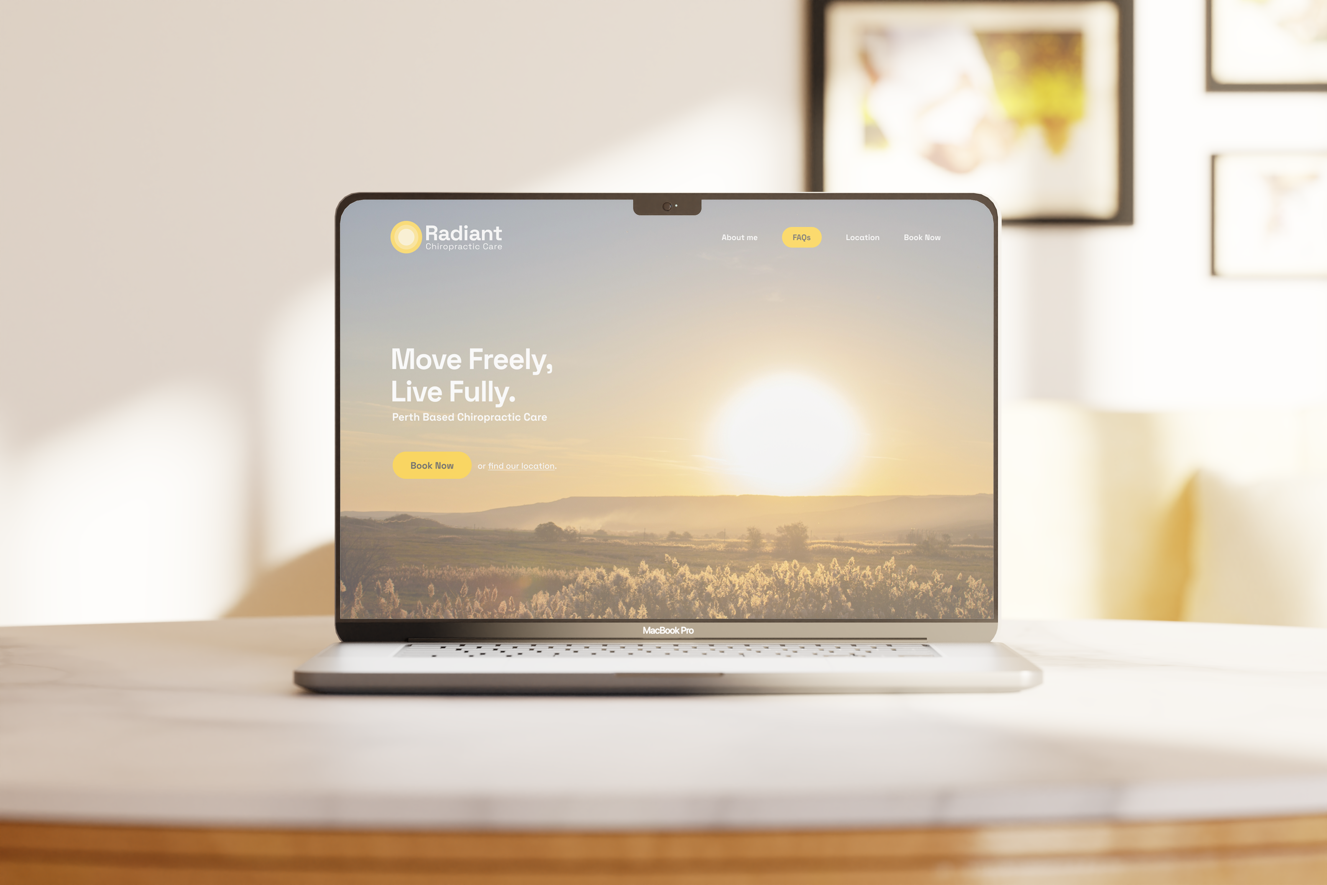
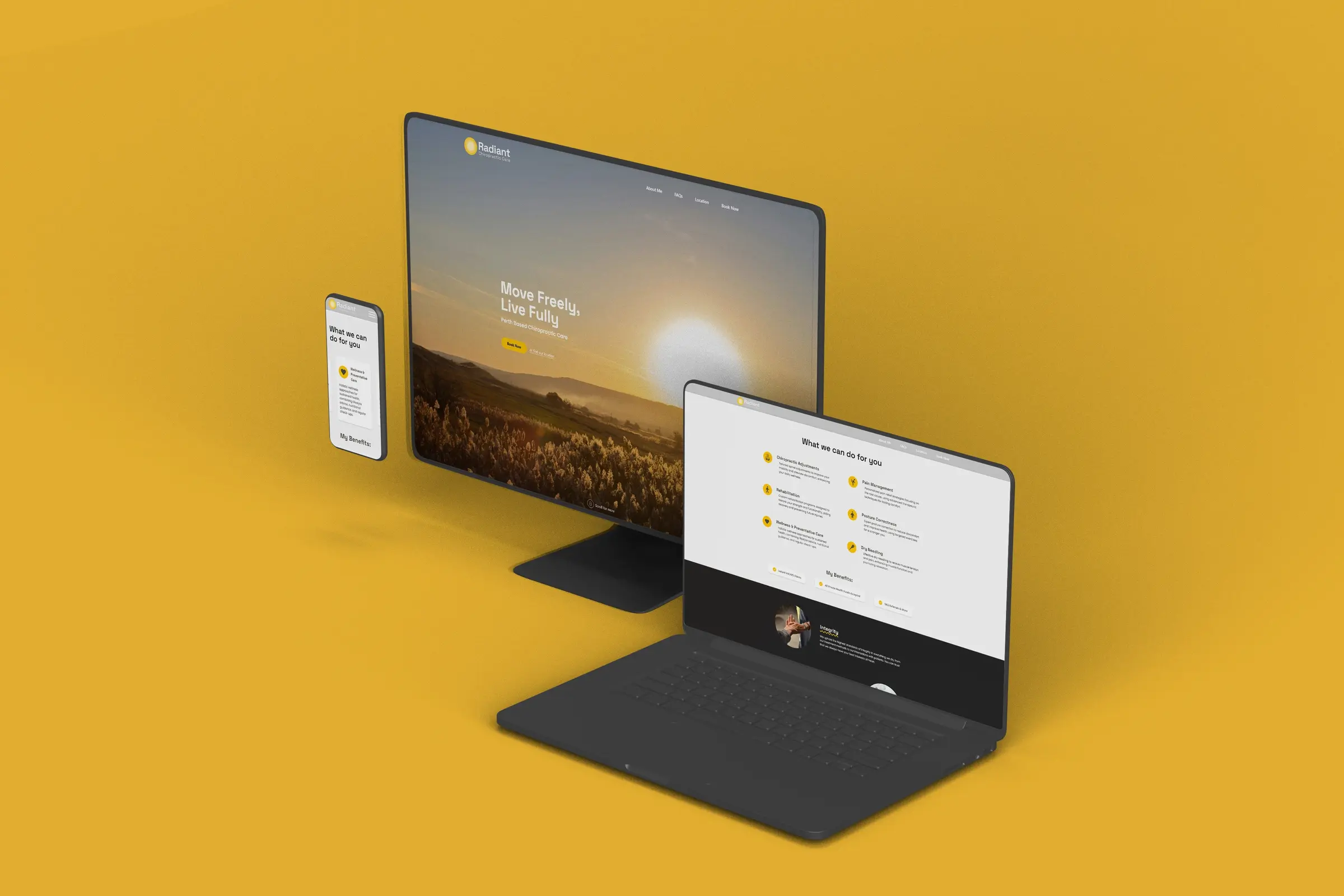
James Kang & I co-designed and developed a singlepage formatted website for a blossoming chiropractor locally. Our goal was to create an easy-to-use website to open the gate for clients both new & existing to book appointments & learn about her practice. We utilised figma for the initial design experimentation, sticking closely towards the brand identity and using that as the basis for our palette, we moved swiftly onto Vite with React & Tailwind CSS for development and experimentation of functionality and features we could implement, like the google maps API and FAQ dropdowns.
Goals
Create an intuitive, single-page website that simplifies appointment booking and provides clear information about the practice to both new and existing clients.
The challenge
Being given a short period of time to go from branding to opening doors, creating a full scale website for the start of the next month presented various challenges, especially co-designing and programming on a commercial level whilst liasing with client expectations. We were tasked with creating a site as an entry point into Mikayla's appointment scheduling system with all her client details.

Process
We began by defining project goals, target audience needs, and core site functionality, creating a clear roadmap from concept to launch. Each phase—from research to deployment—was structured to ensure alignment with the client’s vision and user expectations.


Research
Investigated user needs and competitor sites to understand booking workflows and effective communication of health service information.
Brand Identity System
Design decisions were anchored in the existing brand identity, using the established palette, typography, and visual cues to reflect the practice’s warmth and professionalism while ensuring a cohesive digital presence.
Colour Palette
Explore this palette of colors, each representing a unique shade with space for a description or additional content.
Primary
#FFC400
Secondary
#FDE07E
Tertiary
#9F842A
Other
#FEFEFE
Alternative
#050505
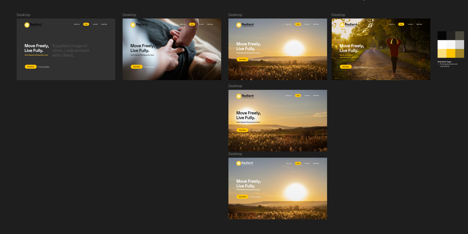
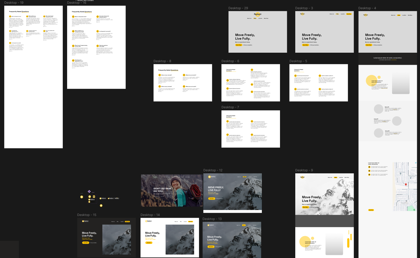
Wireframing
Low-fidelity wireframes in Figma outlined structure, content hierarchy, and user flow, enabling us to validate functionality and navigation before refining the visual design.
UI Design
A clean, approachable interface was designed with accessibility and ease of use in mind, balancing whitespace, typography, and iconography to create a welcoming yet professional experience that aligned seamlessly with the brand.
Development Process
The site was built using Vite, React, and Tailwind CSS for speed, responsiveness, and maintainability, with integrated features such as Google Maps for location access and interactive FAQ dropdowns to enhance usability.